Getting Started
Before actually getting started, it is important to understand the motivation and mechanics behind SUIT:
- Immediate mode is better than retained mode
- Layout should not care about content
- Less is more
Immediate mode?
With classical (retained) mode libraries you typically have a stage where you create the whole UI when the program initializes. This includes what happens when events like button presses or slider changes occur. After that point, the GUI is expected to not change very much. This is great for word processors where the interaction is consistent and straightforward, but bad for games, where everything changes all the time.
With immediate mode libraries, on the other hand, the GUI is created every frame from scratch. Because that would be wasteful, there are no widget objects. Instead, widgets are created by functions that react to UI state and present some data. Where this data comes from and how it is maintained does not concern the widget at all. This is, after all, your job. This gives great control over what is shown where and when. The widget code can be right next to the code that does what should happen if the widget state changes. The layout is also very flexible: adding a widget is one more function call, and if you want to hide a widget, you simply don’t call the corresponding function.
This separation of data and behaviour is great when a lot of stuff is going on, but takes a bit of time getting used to.
What SUIT is
SUIT is simple: It provides only a few basic widgets that are important for games:
Buttons(includingImage Buttons)Text LabelsCheckboxesText InputValue Sliders
SUIT is comfortable: It has a straightforward, yet effective row/column-based layout engine.
SUIT is adaptable: It is possible to change the color scheme, single drawing functions for all widget or the whole theme.
SUIT is hackable: Custom widgets can leverage the extensive core library.
SUIT is good at games!
What SUIT is not
SUIT is not a complete GUI library: It does not provide dropdowns, table views, menu bars, modal dialogs, etc.
SUIT is not a complete GUI library: It does not have a markup language or tools to design a user interface.
SUIT is not a complete GUI library: It does not take control of the runtime. You have to do everything yourself [1].
SUIT is not good at processing words!
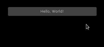
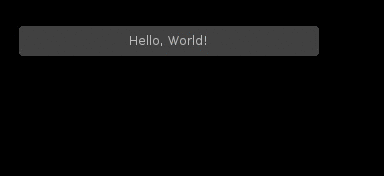
Hello, World!
SUITing up is is straightforward: Define your GUI in love.update(), and
draw it in love.draw():
suit = require 'suit'
local show_message = false
function love.update(dt)
-- Put a button on the screen. If hit, show a message.
if suit.Button("Hello, World!", 100,100, 300,30).hit then
show_message = true
end
-- if the button was pressed at least one time, but a label below
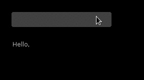
if show_message then
suit.Label("How are you today?", 100,150, 300,30)
end
end
function love.draw()
suit.draw()
end
This will produce this UI:
The two widgets (the button and the label) are each created by a function call
(suit.Button and suit.Label). The first
argument to a widget function always defines the payload of the widget.
Different widgets expect different payloads.
Here, both suit.Button and suit.Label expect a
string.
The last four arguments of a widget function define the position and dimension
of the widget.
The function returns a table that indicates the UI state of the widget.
Here, the state hit is used to figure out if the mouse was clicked and
released on the button. See Widgets for more info on widget
states.
Mutable state
Widgets that mutate some state - input boxes, checkboxes and sliders - expect a table as their payload, e.g.:
local slider = {value = 1, min = 0, max = 2}
function love.update(dt)
    suit.Slider(slider, 100,100, 200,20)
    suit.Label(tostring(slider.value), 300,100, 200,20)
end

The widget function updates the payload when some user interaction occurs. In
the above example, slider.value may be changed by the Slider()
widget. The value is then shown by a Label() next to the slider.
Options
You can define optional, well, options after the payload. Most options affect how the widget is drawn. For example, to align the label text to the left:
local slider = {value = 1, max = 2}
function love.update(dt)
    suit.Slider(slider, 100,100, 200,30)
    suit.Label(tostring(slider.value), {align = "left"}, 300,100, 200,30)
end

What options are available and what they are doing depends on the widget and the theme. See Widgets for more info on widget options.
Keyboard input
The Input() widget requires that you forward the keypressed and
textinput events to SUIT:
local input = {text = ""}
function love.update(dt)
    suit.Input(input, 100,100,200,30)
    suit.Label("Hello, "..input.text, {align="left"}, 100,150,200,30)
end

-- forward keyboard events
function love.textinput(t)
    suit.textinput(t)
end

function love.keypressed(key)
    suit.keypressed(key)
end
The Slider() widget can also react to keyboard input. The mouse state is
automatically updated, but you can provide your own version of reality if you
need to. See the Core functions for more details.
Layout
It is tedious to calculate the position and size of each widget you want to put
on the screen. Especially when all you want is to put three buttons beneath
each other. SUIT implements a simple, yet effective layout engine. All the
engine does is put cells next to each other (below or right). It does not care
what you put into those cells, but assumes that you probably need them for
widgets. Cells are reported by four numbers (left, top, width and height) that
you can directly pass as the final four arguments to the widget functions.
If you have ever dabbled with Qt’s QBoxLayout, you
already know 89% [2] of what you need to know.
Hello, World! can be rewritten as follows:
suit = require 'suit'

local show_message = false
function love.update(dt)
    -- put the layout origin at position (100,100)
    -- cells will grow down and to the right of the origin
    -- note the colon syntax
    suit.layout:reset(100,100)

    -- put 10 extra pixels between cells in each direction
    suit.layout:padding(10,10)

    -- construct a cell of size 300x30 px and put the button into it
    if suit.Button("Hello, World!", suit.layout:row(300,30)).hit then
        show_message = true
    end

    -- add another cell below the first cell
    -- the size of the cell is the same as the first cell
    if show_message then
        suit.Label("How are you today?", suit.layout:row())
    end
end

function love.draw()
    suit.draw()
end
At the beginning of each frame, the layout origin (and some internal layout
state) has to be reset. You can also define optional padding between cells.
Cells are added using layout:row(w,h) (which puts the new cell below the
old cell) and layout:col(w,h) (which puts the new cell to the right of the
old cell). If omitted, the width and height of the new cell are copied from
the old cell. There are also special identifiers that calculate the size from
the sizes of all cells that were created since the last reset(): max,
min and median. They do what you expect them to do.
It is also possible to nest cells and to let cells dynamically fill the available space (but you have to tell how much space there is beforehand). Refer to the Layout documentation for more information.
Widget ids
Each widget is identified by an id [4]. Internally, this id is used to
figure out which widget should handle user input like mouse clicks and keyboard
presses.
Unless specified otherwise, the id is the same as the payload, i.e.,
the id of Button("Hello, World!", ...) will be the string
"Hello, World!".
In almost all of the cases, this will work fine and you don’t have to worry about
this id business.
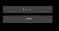
Well, almost. Problems arise when two widgets share the same id, like here:
local suit = require 'suit'

function love.update()
    suit.layout:reset(100, 100)
    suit.layout:padding(10)

    if suit.Button("Button", suit.layout:row(200, 30)).hit then
        love.graphics.setBackgroundColor(255,255,255)
    end
    if suit.Button("Button", suit.layout:row()).hit then
        love.graphics.setBackgroundColor(0,0,0)
    end
end

function love.draw()
    suit:draw()
end
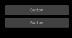
If the first button is hovered, both buttons will be highlighted, and if it pressed, both actions will be carried out. Hovering the second button will not affect the first, and clicking it will highlight both buttons, but only execute the action of the second button [5].
Luckily, there is a fix: you can specify the id of any widget using the id
option, like so:
local suit = require 'suit'

function love.update()
    suit.layout:reset(100, 100)
    suit.layout:padding(10)

    if suit.Button("Button", {id=1}, suit.layout:row(200, 30)).hit then
        love.graphics.setBackgroundColor(255,255,255)
    end
    if suit.Button("Button", {id=2}, suit.layout:row()).hit then
        love.graphics.setBackgroundColor(0,0,0)
    end
end

function love.draw()
    suit:draw()
end
Now, events from one button will not propagate to the other. Here, the both id s
are numbers, but you can use any Lua value except nil and false.
Themeing
SUIT lets you customize how any widget (except ImageButton()) is drawn.
Each widget (except, you know) is drawn by a function in
the table suit.theme. Conveniently, the name of the function
responsible for drawing a widget is named after it, so, a button is drawn by
the function suit.theme.Button. If you want to change how a button is
drawn, simply overwrite the function. If you want to redecorate completely, it
might be easiest to start from scratch and swap the whole table.
However, if you just don’t like the colors, the default theme is open to change.
It requires you to change the background (bg) and foreground (fg) color
of three possible widget states: normal, when nothing out of
the ordinary happened, hovered, when the mouse hovers above a widget, and
active, when the mouse hovers above, and the mouse button is pressed (but
not yet released) on the widget. The colors are saved in the table
suit.theme.color. The default color scheme is this:
suit.theme.color = {
    normal  = {bg = { 66, 66, 66}, fg = {188,188,188}},
    hovered = {bg = { 50,153,187}, fg = {255,255,255}},
    active  = {bg = {255,153,  0}, fg = {225,225,225}}
}
You can also do minimally invasive surgery:
function love.load()
    suit.theme.color.normal.fg = {255,255,255}
    suit.theme.color.hovered = {bg = {200,230,255}, fg = {0,0,0}}
end
GUI Instances
Sometimes you might feel the need to separate parts of the GUI. Maybe certain should always be drawn before or after other UI elements, or maybe you don’t want the UI state to “leak” (e.g., from a stacked pause gamestate to the main gamestate).
For this reason, SUIT allows you to create GUI instances:
local dress = suit.new()
The IO and layout state of dress is totally contained in the instance and
does not affect any other instances (including the “global” instance suit).
In particular, suit.draw() will not draw anything from dress. Luckily,
you can do that yourself:
dress:draw()
Notice that instances require that you use the colon syntax. This is true for every core <core> function as well as the widgets. To create a button, for example, you have to write:
dress:Button("Click?", dress.layout:row())
Instance Theme
Unlike UI and layout state, themes are shared among instances. The reason
is that the suit.theme and dress.theme are references, and point to
the same table (unless you make either of them point somewhere else). Usually
this is a feature, but please still consider this
Warning
Changes in a shared theme will be shared across GUI instances.
If this is an issue—for example because you only want to change the color scheme of an instance—you can either deep-copy the theme table or use some metatable magic:
dress.theme = setmetatable({}, {__index = suit.theme})

-- NOTE: you have to replace the whole color table. E.g., replacing only
--       dress.theme.color.normal will also change suit.theme.color.normal!
dress.theme.color = {
    normal   = {bg = {188,188,188}, fg = { 66, 66, 66}},
    hovered  = {bg = {255,255,255}, fg = { 50,153,187}},
    active   = {bg = {255,255,255}, fg = {225,153,  0}}
}

function dress.theme.Label(text, opt, x,y,w,h)
    -- draw the label in a fancier way
end
| [1] | But it thinks you can handle that. |
| [2] | Proportion determined by rigorous scientific experiments [3]. |
| [3] | And theoretic reasoning. Mostly that, actually. |
| [4] | Welcome to the tautology club! |
| [5] | Immediate mode is to blame: When the second button is processed, the first one is already fully evaluated. Time can not be reversed, not even by love. |